PANTONE Fashion Color Report, Fall/Winter 2017/2018
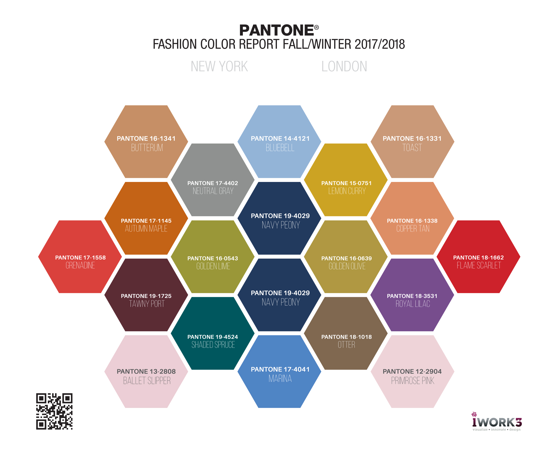
Every season, Pantone evaluates the colors shown by fashion designers in their collections at New York Fashion Week. This information is then used to create the Fashion Color Report where top 10 colors are highlighted for the upcoming season. For the first time ever, Pantone has added London Fashion Week to their seasonal color report.
Color Palette for New York Autumn/Winter 2017/2018
Fall 2017 color palette leans toward the warm hues. PANTONE 17-1558 Grenadine is a powerful, evocative, dynamic red. It is a confident and self-assured attention-getter. While PANTONE 17-1145 Autumn Maple is the quintessential autumn color; tawny and warm. Then comes PANTONE 19-1725 Tawny Port, a darker, elegant, sophisticated, and tasteful red. Rounding off the warm colors is PANTONE 13-2808 Ballet Slipper, a softer touch, flattering and rosy red.
Hex#: DA413D
RGB: 218 65 61
CMYK: 0.70.72.15
Pantone: 17-1558
Grenadine
Hex#: C46215
RGB: 196 98 21
CMYK: 0.50.89.23
Pantone: 17-1145
Autumn Maple
Hex#: 5C2C35
RGB: 92 44 53
CMYK: 0.52.42.64
Pantone: 19-1725
Tawny Port
Hex#: EBCED5
RGB: 235 206 213
CMYK: 0.12.9.8
Pantone: 13-2808
Ballet Slipper
As in most any season, neutrals have its place in the 2017 Fall collection. PANTONE 16-1341 Butterum is a snug, warming, and toasty shade. While PANTONE 17-4402 Neutral Gray, the standard bearer of all neutrals, shares the anchoring role with Navy Peony in this palette.
Hex#: C68F65
RGB: 198 143 101
CMYK: 0.28.49.22
Pantone: 16-1341
Butterum
RGB: 142 145 143
CMYK: 2.0.1.43
Pantone: 17-4402
Neutral Gray
Finally, Fall 2017’s cool hues: Starting with the fresh and bright PANTONE 17-4041 Marina, which evokes vitality and coolness. Followed by PANTONE 19-4029 Navy Peony, which is an anchor for both the NY and London palettes. Navy Peony is a dependable, stable and anchoring shade. PANTONE 19-4524 Shaded Spruce is a green that speaks of sheltering and protection as evergreen trees. And finally, PANTONE 16-0543 Golden Lime, a yellow-green shade that offers a refreshing complement to fall classics with its golden undertones.
Hex#: 4F84C4
RGB: 79 132 196
CMYK: 60.33. 0.23
Pantone: 17-4041
Marina
Hex#: 223A5E
RGB: 34 58 94
CMYK: 64.38.0.63
Pantone: 19-4029
Navy Peony
Hex#: 00585E
RGB: 0 88 94
CMYK: 100.6. 0.63
Pantone: 19-4524
Shaded Spruce
Hex#: 9A9738
RGB: 154 151 56
CMYK: 0.2.64.40
Pantone: 16-0543
Golden Lime
Color Palette for London Autumn/Winter 2017/2018
The warm hues of London’s colors kick of this palette with PANTONE 18-1662 Flame Scarlet leading the way. Flame Scarlet is a vivid, powerful red. It is followed by PANTONE 16-1338 Copper Tan, a burnished shade known for its welcoming warmth. PANTONE 15-0751 Lemon Curry is an exotic and spicy seasonal color. It is rounded off with a PANTONE 16-0639 Golden Olive, which narrows the line between warm (with its golden hues) and cool hues (with its staunch yet stately green undertones).
Hex#: CD212A
RGB: 205 33 42
CMYK: 0.84.80.20
Pantone: 18-1662
Flame Scarlet
Hex#: DE8E65
RGB: 222 142 101
CMYK: 0.36.55.13
Pantone: 16-1338
Copper Tan
Hex#: CDA323
RGB: 205 163 35
CMYK: 0.20.83.20
Pantone: 15-0751
Lemon Curry
Hex#: AF9841
RGB: 175 152 65
CMYK: 0.13.63.31
Pantone: 16-0639
Golden Olive
The neutrals for London looks to be PANTONE 16-1331 Toast, a comforting, warmhearted color, and PANTONE 18-1018 Otter, a country, earthy color that comes to the city.
Hex#: CA9978
RGB: 202 153 120
CMYK: 0.24.41.21
Pantone: 16-1331
Toast
RGB: 127 103 79
CMYK: 0.19.38.50
Pantone: 18-1018
Otter
Finally, London’s cool hues: beginning with PANTONE 12-2904 Primrose Pink, an embracing and gentle pale pink shade (that has a tinge of purple undertones). Then followed by PANTONE 18-3531 Royal Lilac, an enchanting purple that provides a theatrical linkage to the other colors in the palette. PANTONE 19-4029 Navy Peony is the dependable and anchoring mainstay for the season. Finally, PANTONE 14-4121 Bluebell is a tranquil blue that soothes, connects and brings peace.
Hex#: EED4D9
RGB: 238 212 217
CMYK: 0.11.9.7
Pantone: 12-2904
Primrose Pink
Hex#: 774D8E
RGB: 119 77 142
CMYK: 16.46.0.44
Pantone: 18-3531
Royal Lilac
Hex#: 223A5E
RGB: 34 58 94
CMYK: 64.38.0.63
Pantone: 19-4029
Navy Peony
Hex#: 93B4D7
RGB: 147 180 215
CMYK: 32.16.0.16
Pantone: 14-4121
Bluebell