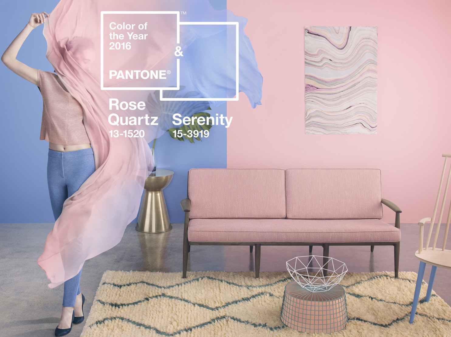
For the first time, Pantone has declared a blend of two shades as its color of the year for 2016: Rose Quartz PANTONE 13-1520 & Serenity PANTONE 15-3919.
The new 2016 Pantone Color of the Year: Rose Quartz and Serenity is a modern day stress reliever that simultaneously reassures and calms the being.
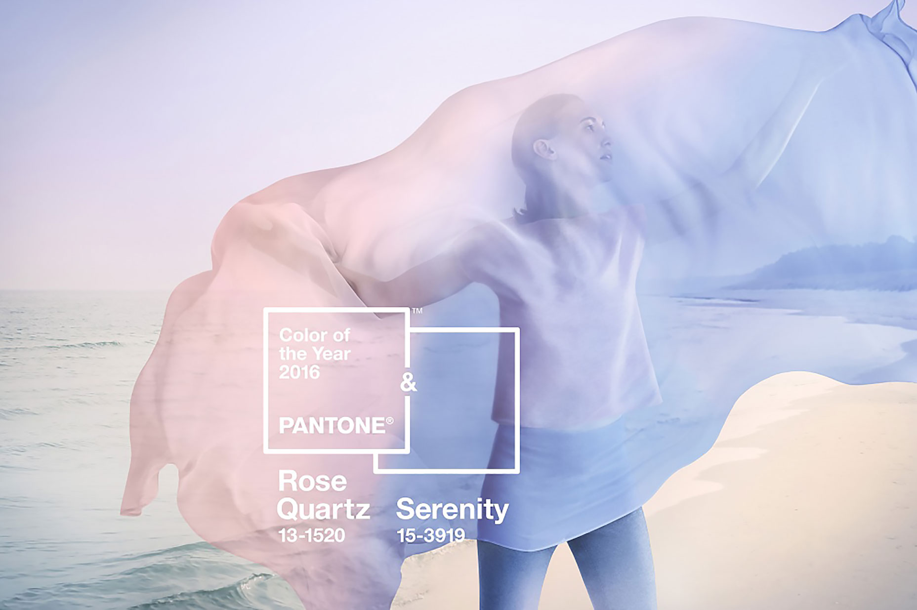
The balance between the warm rose and the cool blue soothes and brings peace and order. The Rose Quartz is gentle while Serenity is airy, a combination that brings respite in these stressful and turbulent times.
The combination of the two shades quiets the mind, introduces calm and balance, which leads to an increase in focus and productivity.
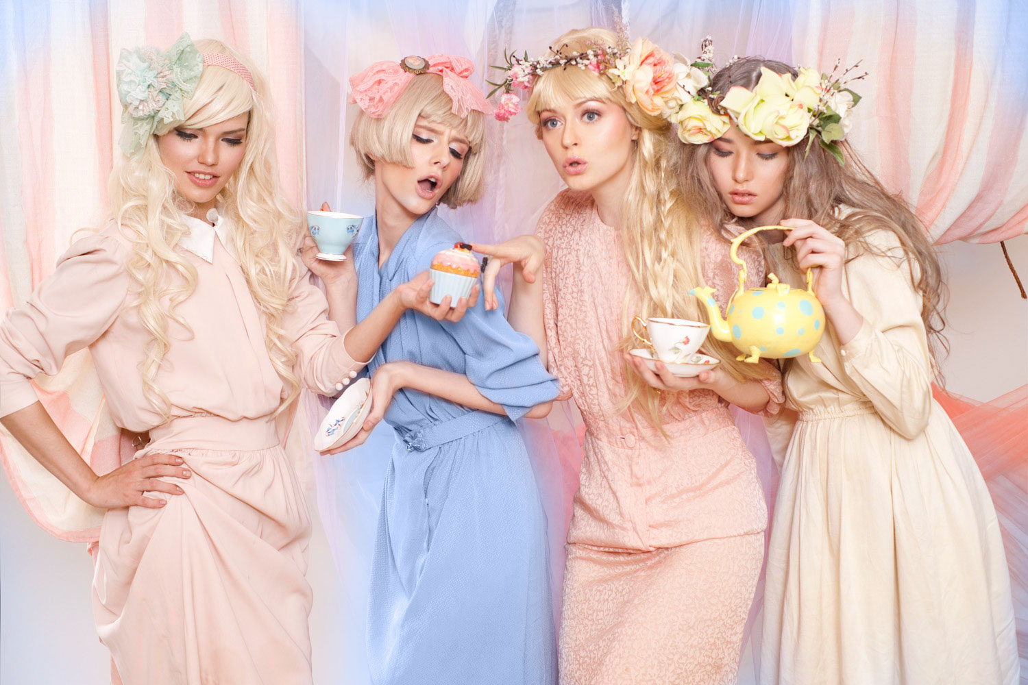
The colors easily translates (and can already be seen) in fashion, beauty, industrial design, home furnishings and interiors.
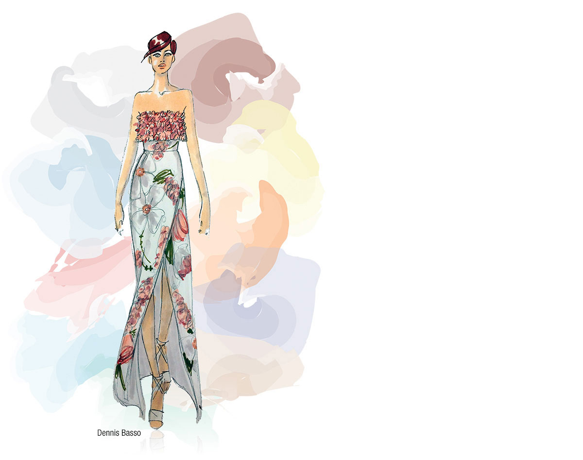
The first glimpse of these colors can be seen in the Spring 2016 hues from NY’s Fashion Week last year, the beginning of the softer shade trend.
The unique pairing of the two colors challenges traditional perceptions of color association (blue for boys and pink for girls). The world is seeing an increase in androgynous fashion (gender blurring fashion: men’s to women’s and vice versa), which in turn impacts color trends in other areas of design.
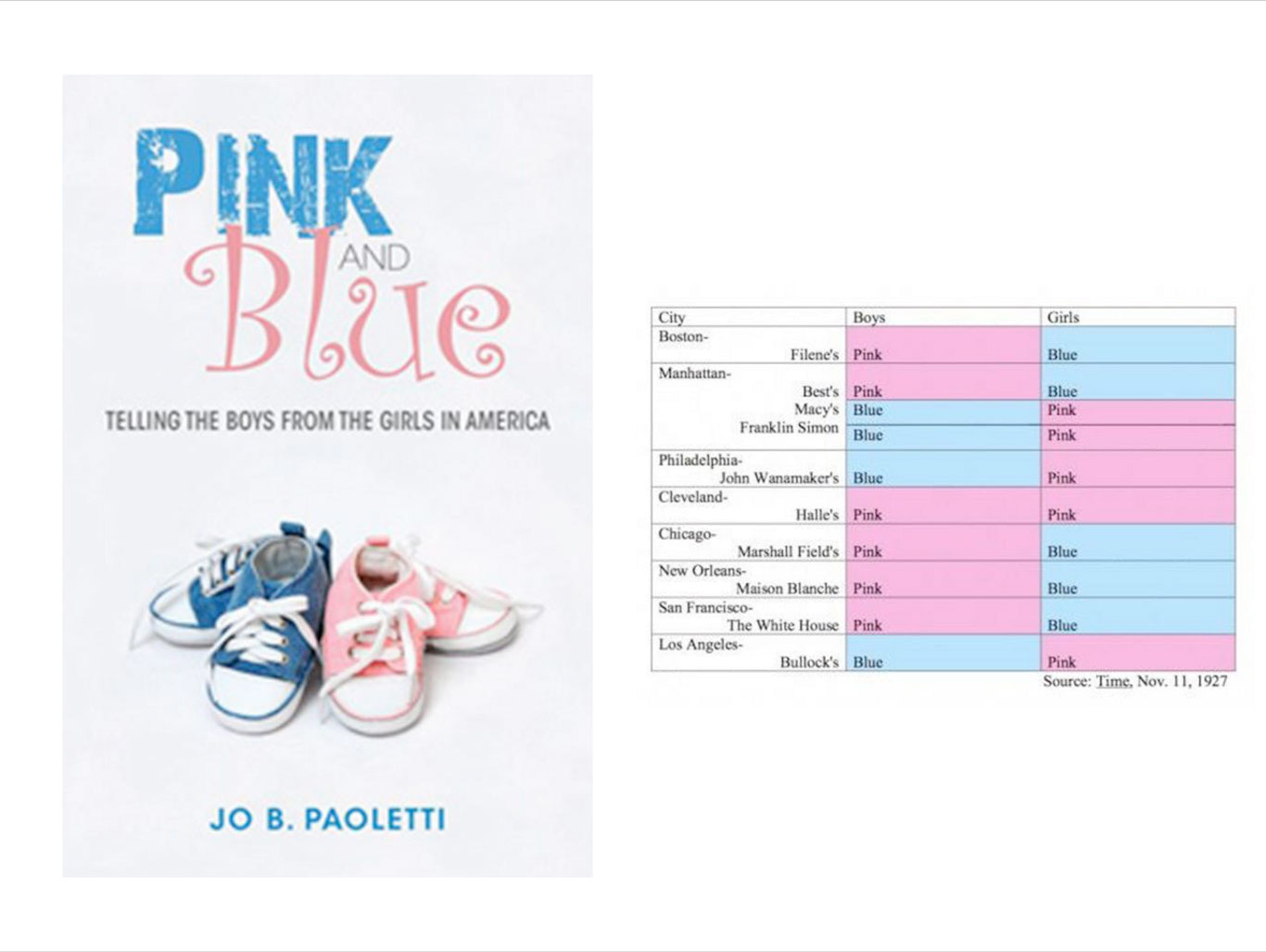
History of the color pink and blue
Before the 1920s, pink was deemed by many guides to be more appropriate for boys and blue for girls. The earliest references to this original color scheme appeared in a June of 1918 edition of the trade publication Earnshaw’s Infants’ Department,
“The generally accepted rule is pink for the boys, and blue for the girls. The reason is that pink, being a more decided and stronger color, is more suitable for the boy, while blue, which is more delicate and dainty, is prettier for the girl.” – todayifoundout.com
In 1927, Time magazine printed a chart highlighting gender-appropriate colors for girls and boys according to leading U.S. retailers.
This gender color code changed in the 40s when clothing manufacturers randomly decided on pink for girls and blue for boys.
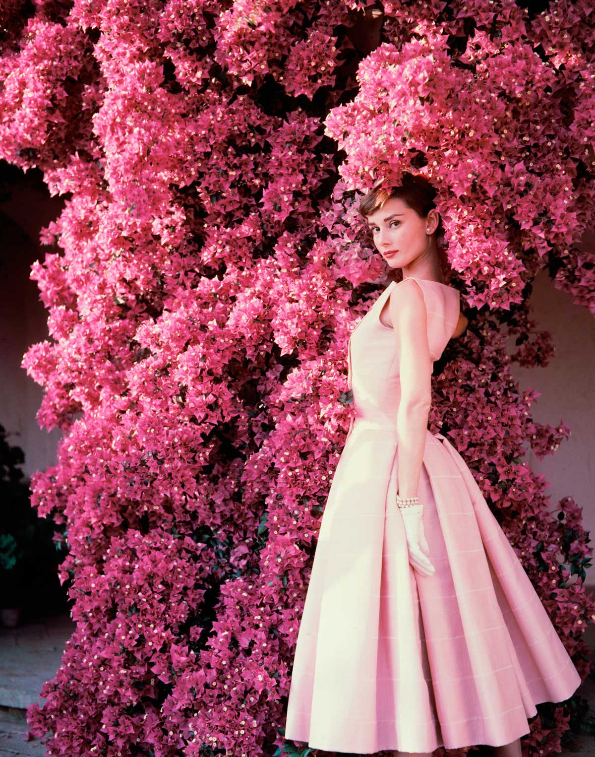
Then in the late 1950s and 1960s, with the break out of Audrey Hepburn’s Breakfast at Tiffany, pink was cemented as the color of the fairer sex.
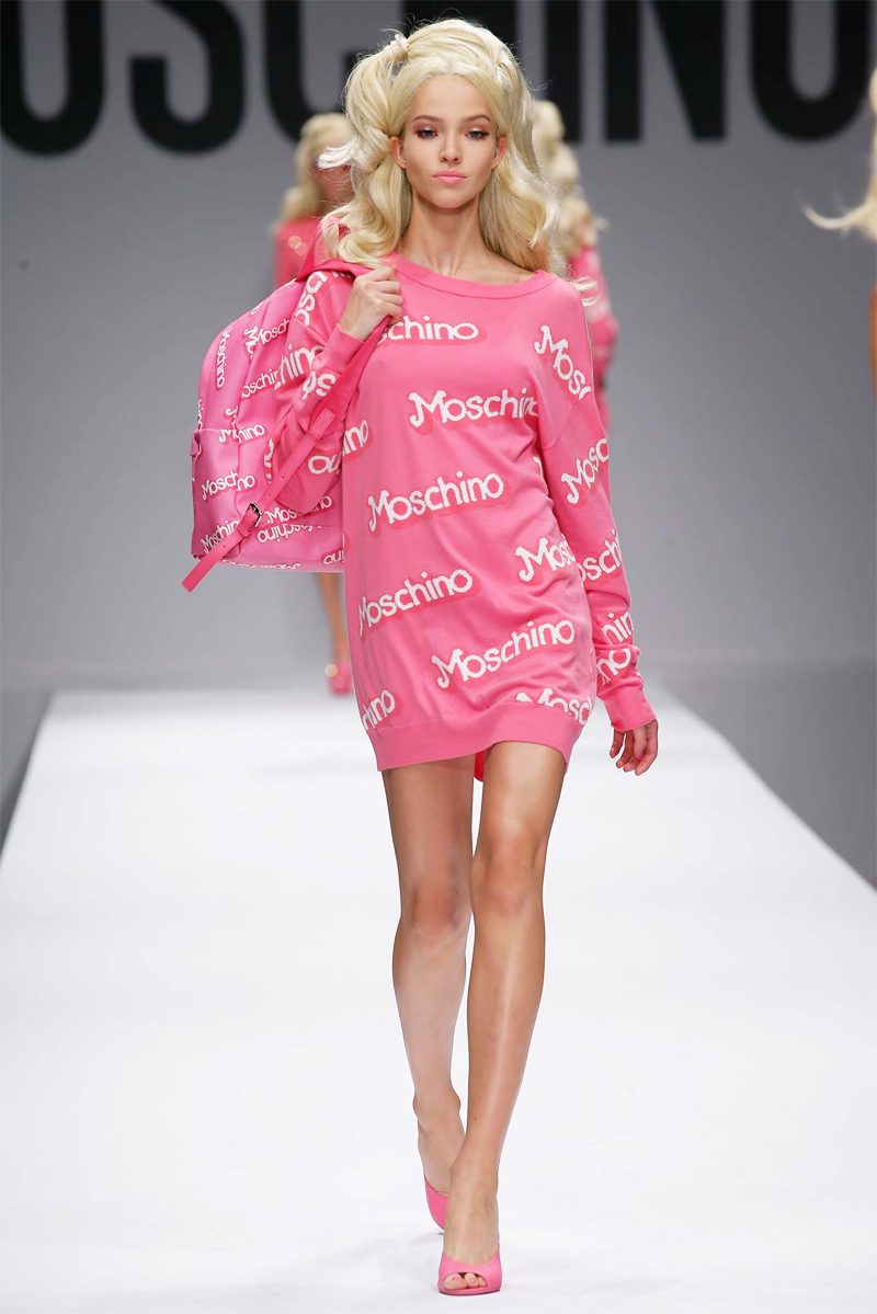
Which lent to the color for Barbie.
(Moschino)
In the 80s, the color pink was used by Susan B. Komen’s fight for breast cancer (and is now synonymous with the cause), and even became the color of feminism. It then became the color used by UN for it’s gender equality movement, #HeForShe in September 2014.
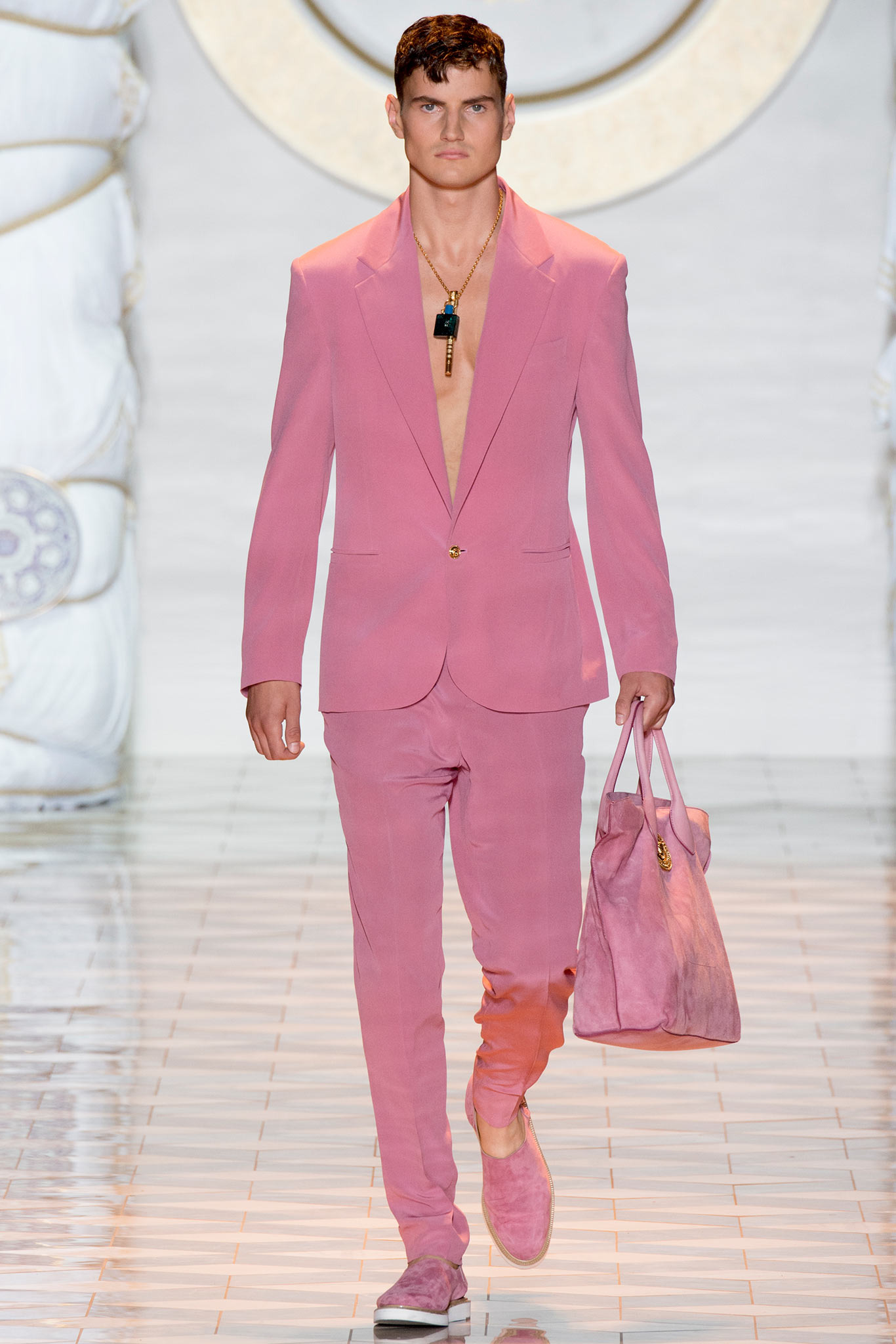
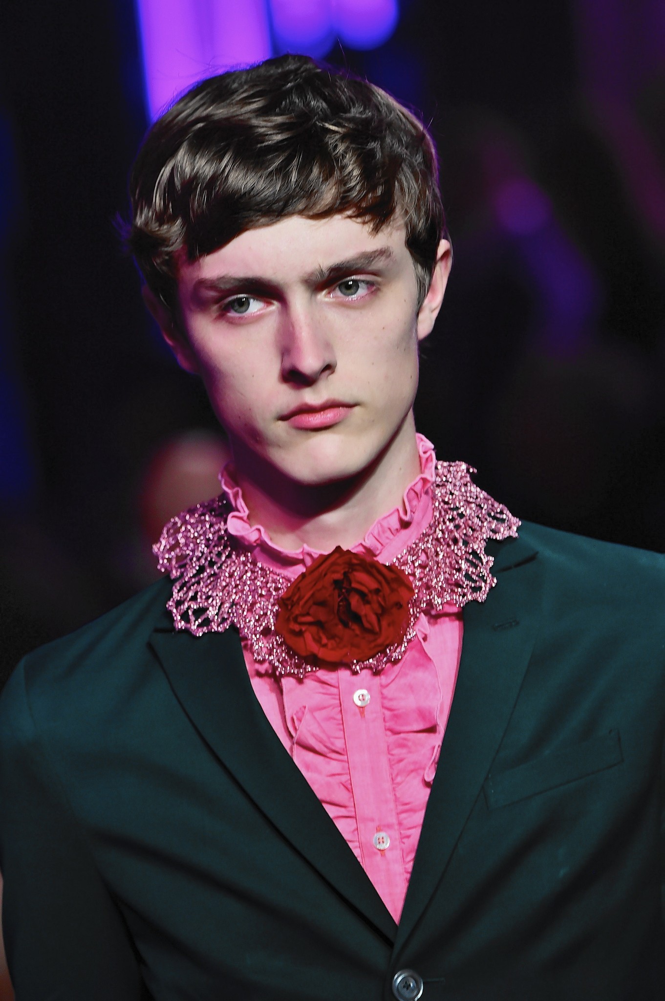
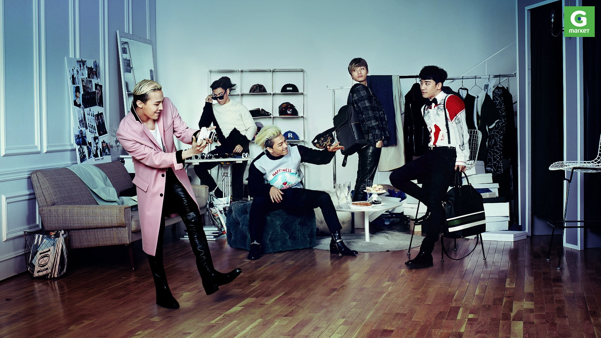
Today, the colors have broken the gender stereotype, and pink is used by designers and stars alike for an androgynous quality.
(L-R, T-B: Versace, Gucci, BigBang)
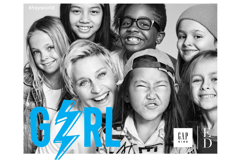
Kids: Gender neutral
(T-B: Acne Studios, Gap Kids)

Color Guide for both Rose Quartz & Serenity
Rose Quartz
Color Breakdown
for the web, screen and print
ROSE QUARTZ 13-1520 | Pastel 9281 C
Hex#: F7CAC9 | Pastel 9281 C Hex#: F2DDDE
RGB: 247.202.201 | Pastel 9281 RGB: 242.221.222
CMYK: 0.24.15.0 | Pastel 9281 CMYK: 0.14.9.0
Serenity
Color Breakdown
for the web, screen and print
SERENITY 15-3919 | PLUS Series 7451 C
Hex#: 92A8D1 | PLUS Series 7451 C Hex#: 89ABE3
RGB: 146.168.209 | PLUS Series 7451 C RGB: 137.171.227
CMYK: 42.24.3.0 | PLUS Series 7451 C CMYK: 46.23.0.0
The many uses and everyday application of Rose Quartz x Serenity
In fashion
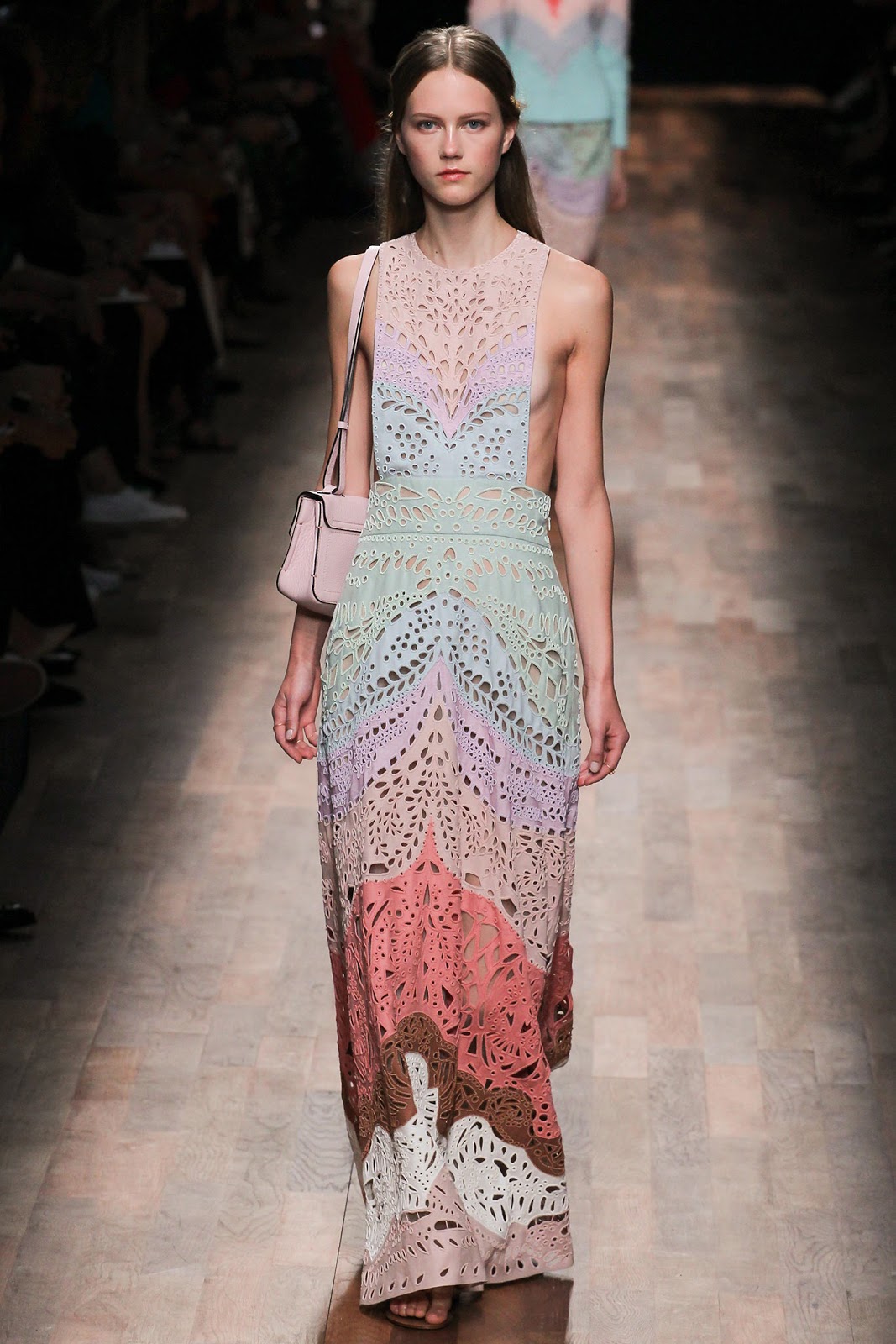
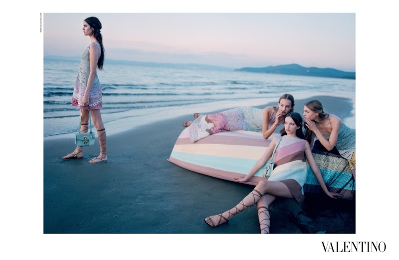
Valentino Spring/Summer 2015 collection
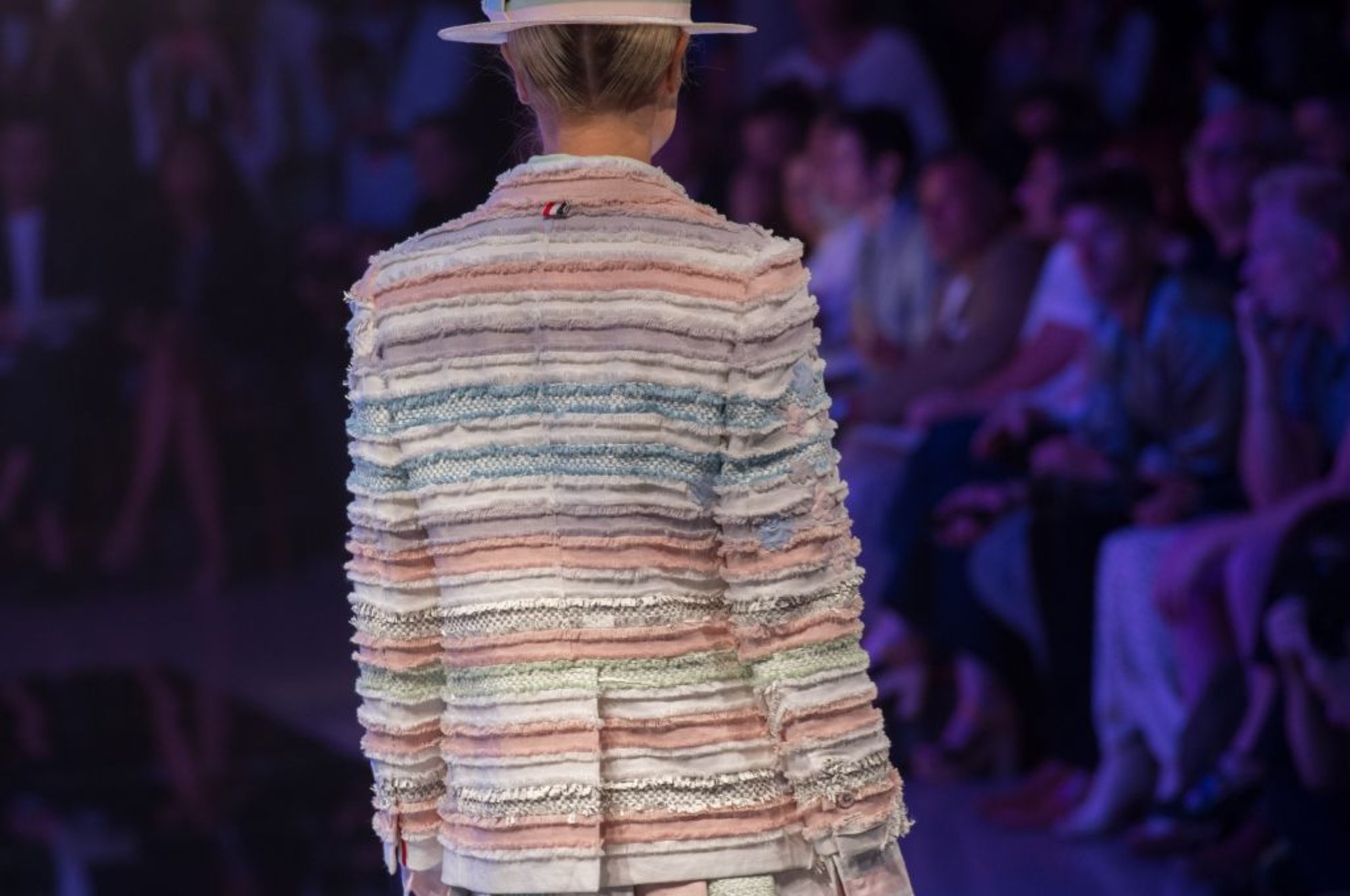
Thom Browne Spring 2016 collection
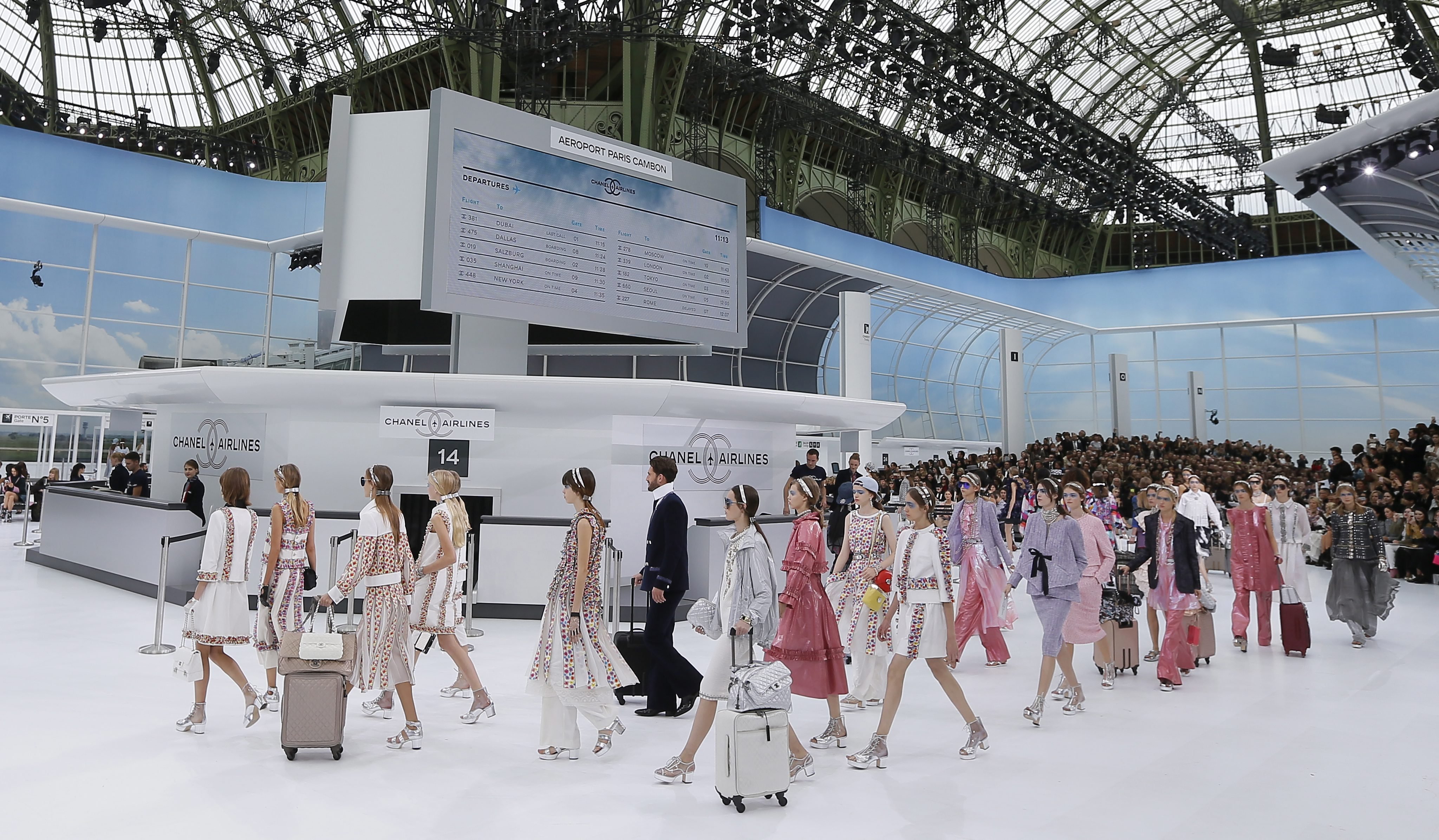
Karl Lagerfeld for Chanel 2016 Spring/Summer collection
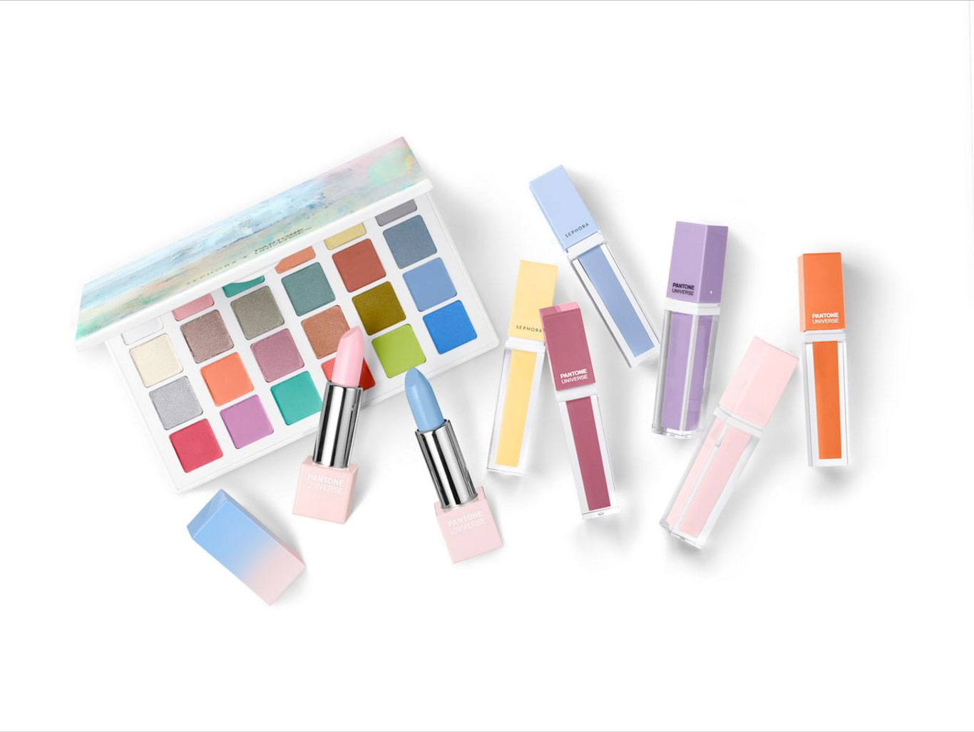
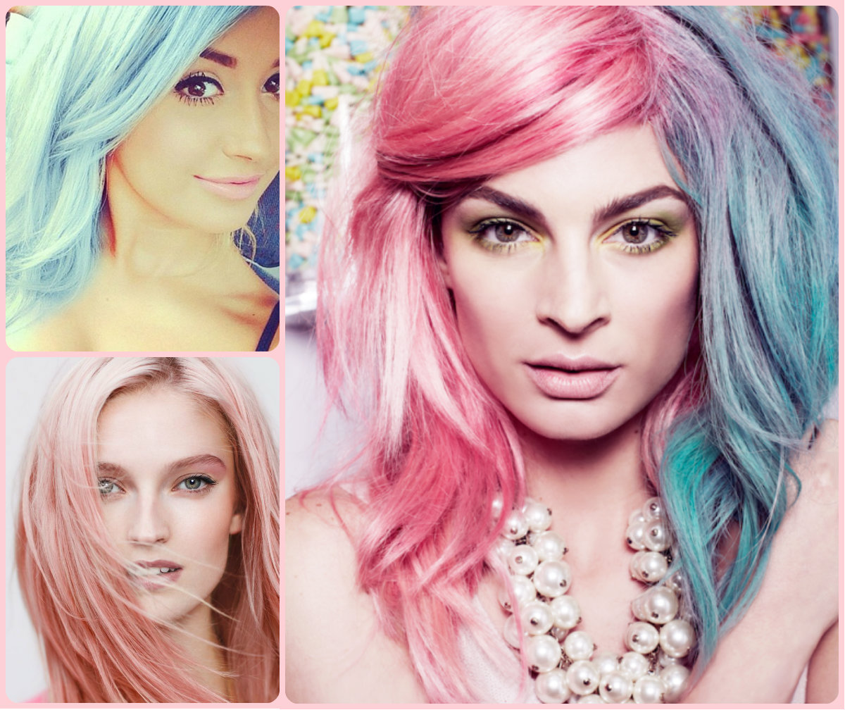
In makeup + hair
image of “Cake” courtesy of rainbowhaircolour.com

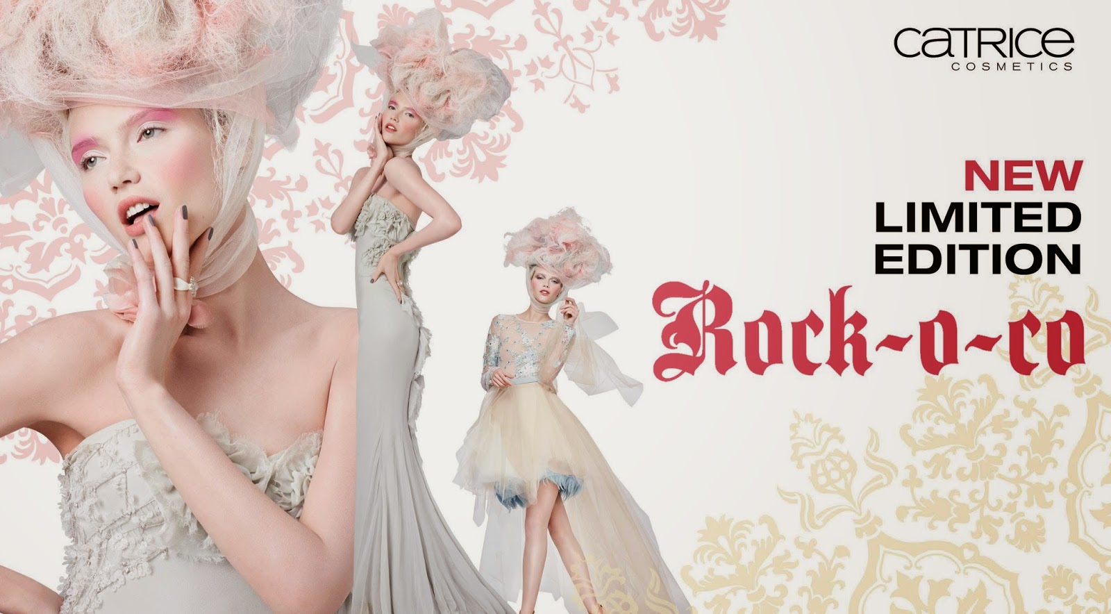
Catrice makeup 2015
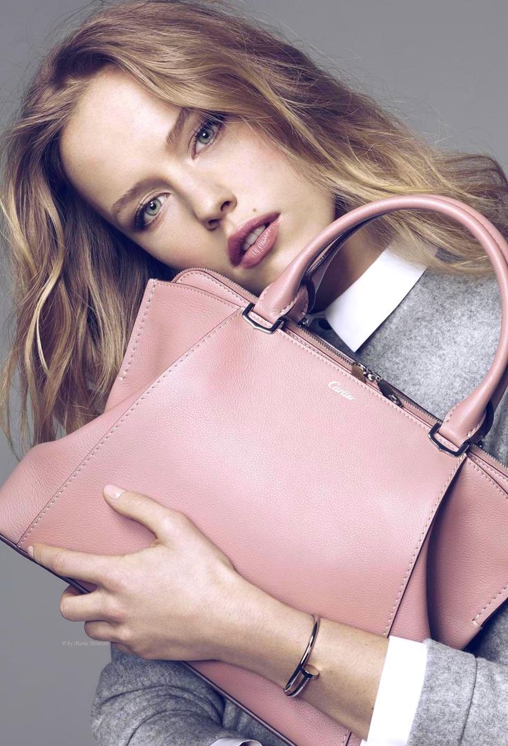
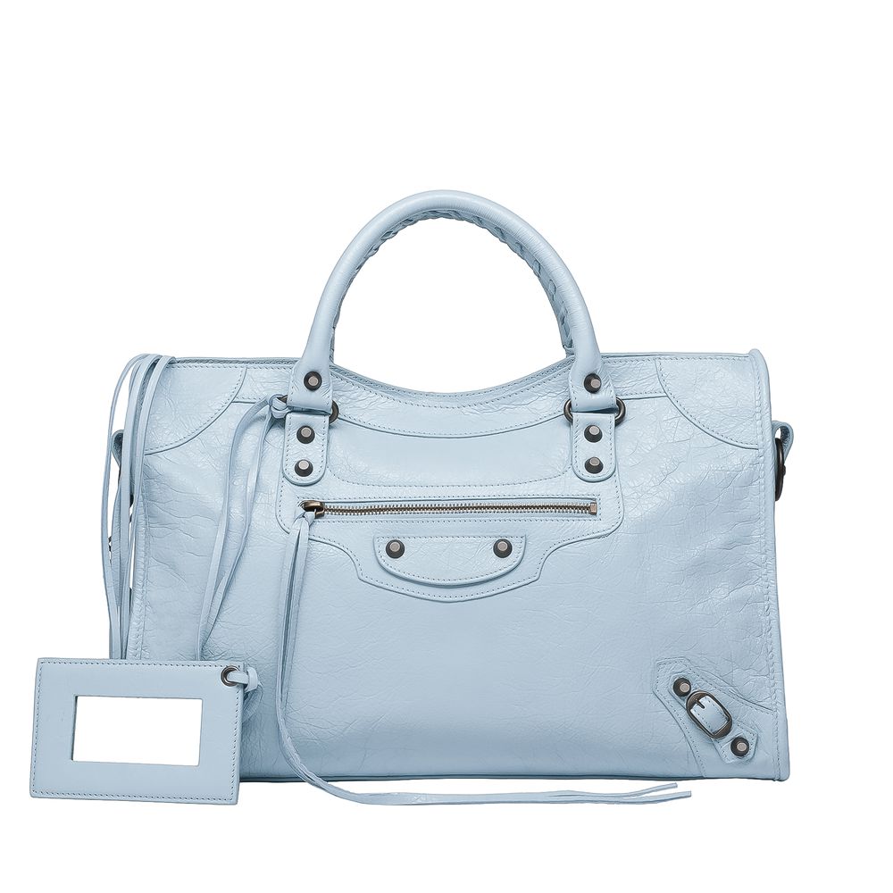
In bags
Cartier Blush Leather Satchel 2015
Balenciaga City Bag
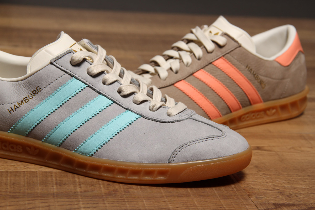
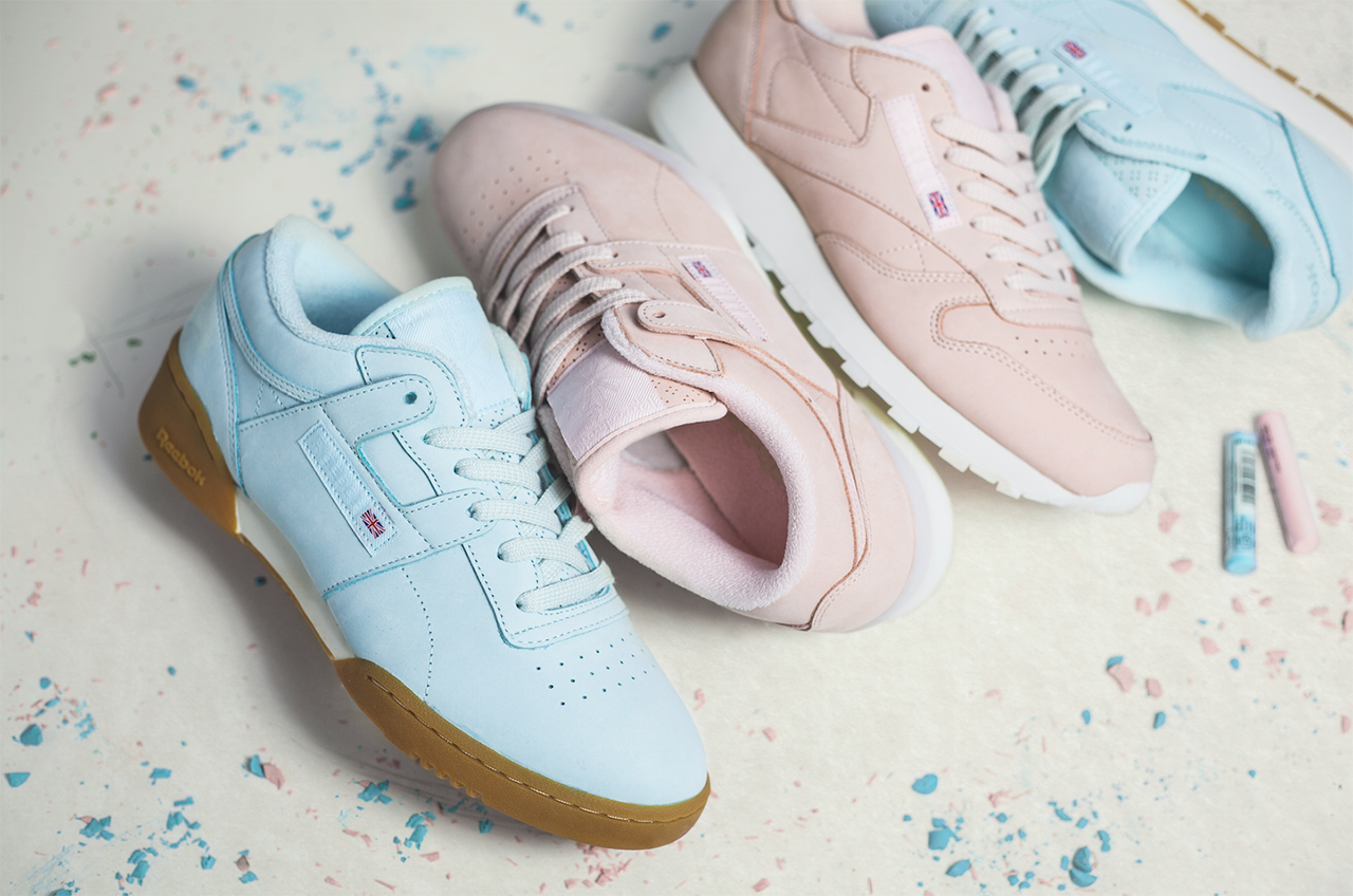
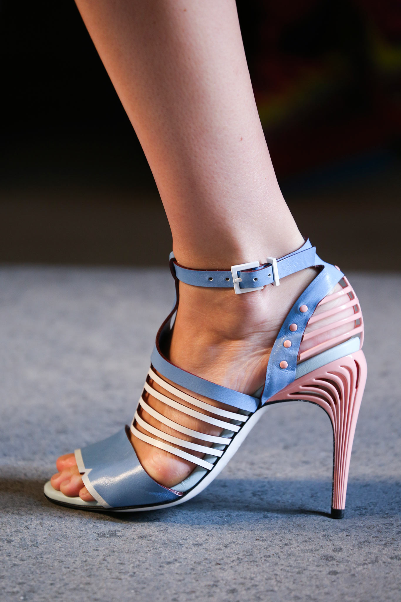
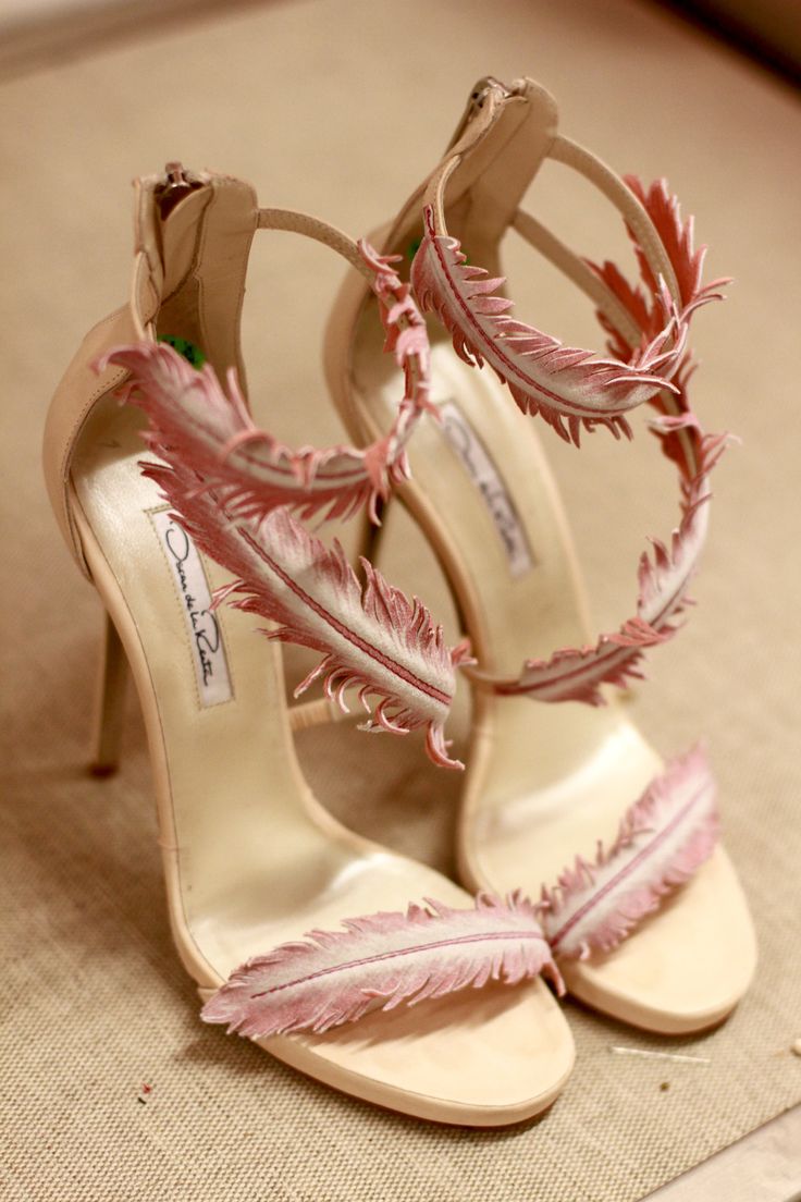
In shoes
Jimmy Choo Rosana Ballet Lace-up Pumps 2015
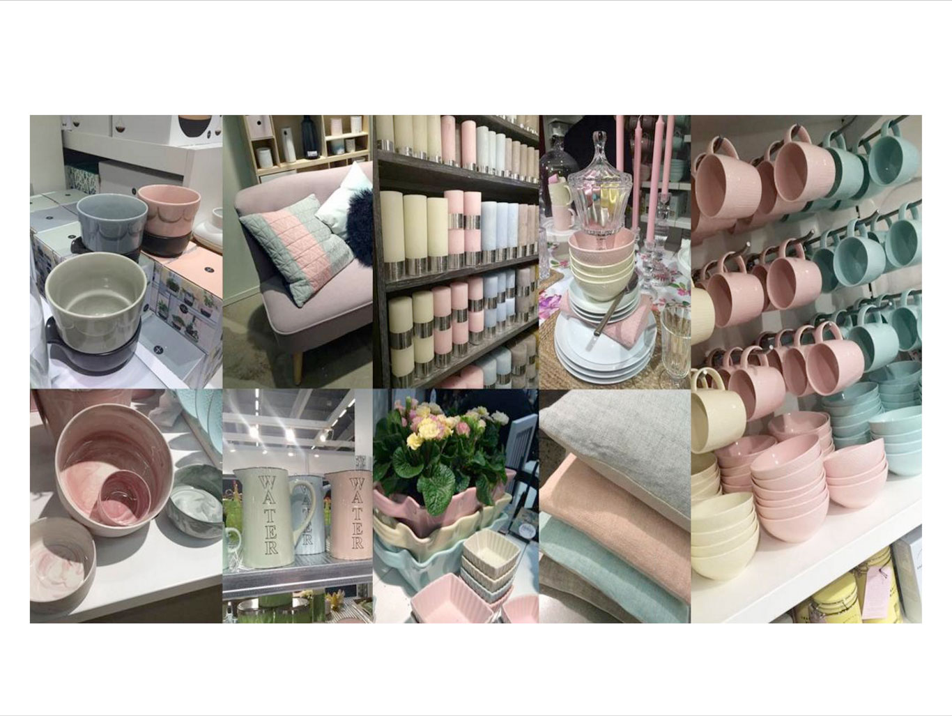
Rose Quartz and Serenity’s calming and airy characteristics make it an ideal choice for home decoration, packaging, print and art.
In home (decor)
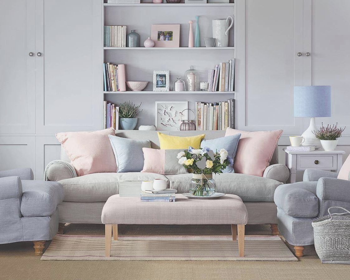
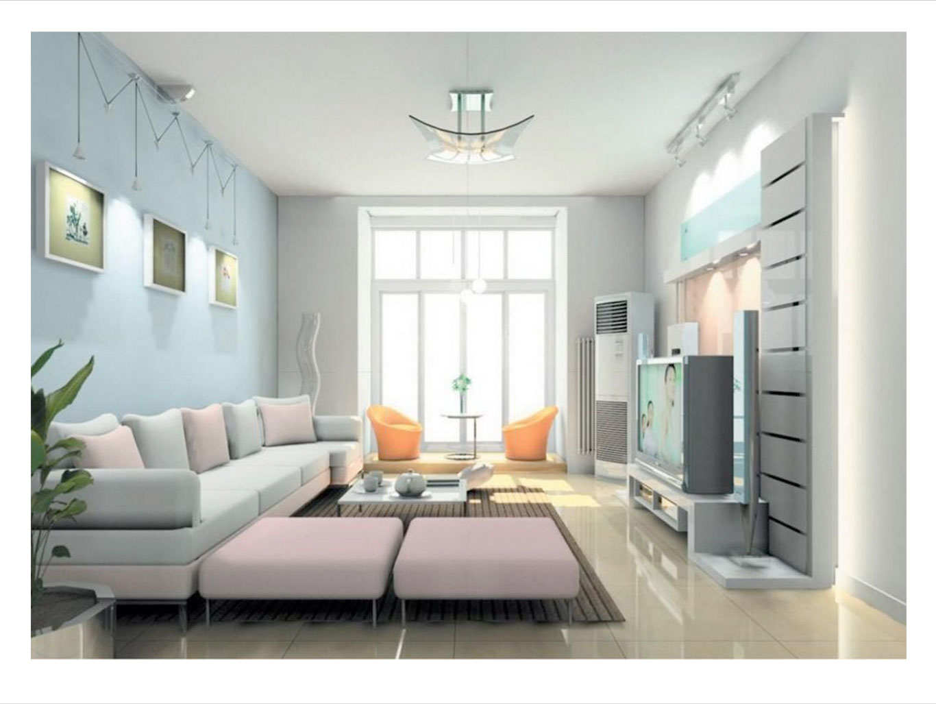
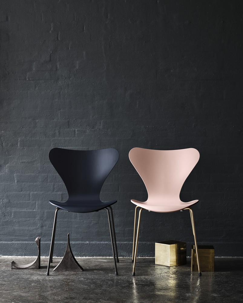
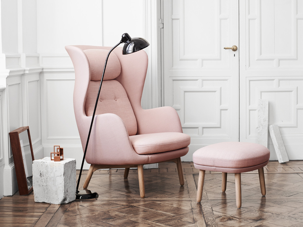
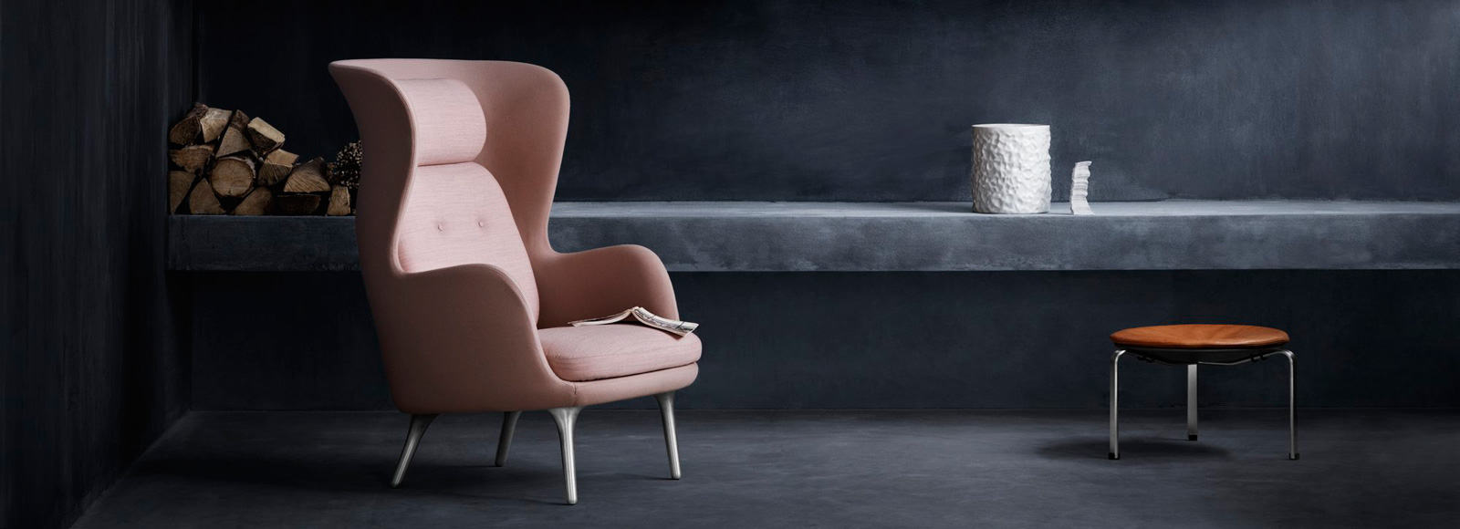
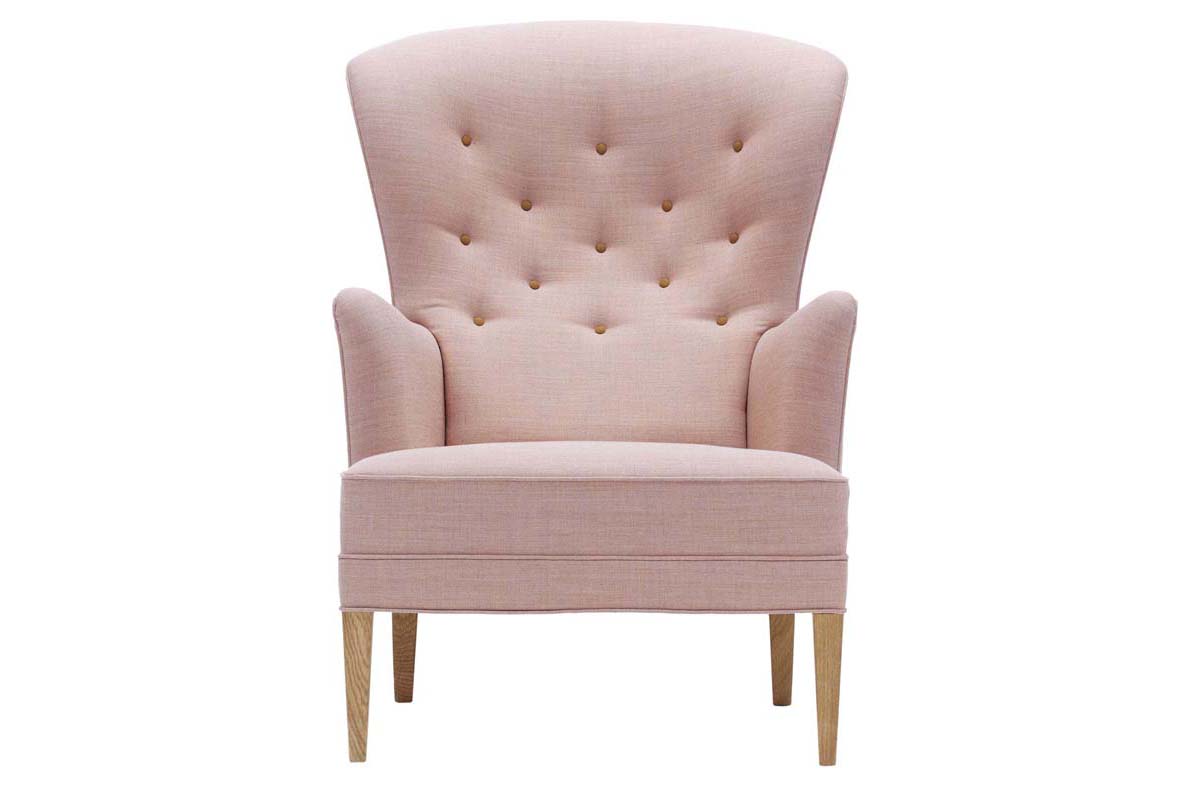
In home (furnishings)
Fritz Handsen Series 7
Jaime Hayon for Fritz Handsen “Ro” lounge chair
Carl Hansen & Son “Heritage” chair
In home (table settings)
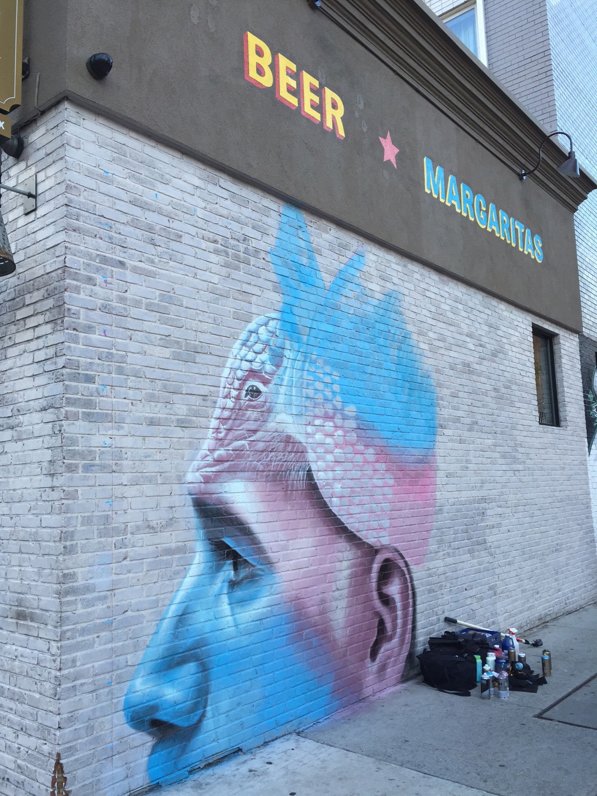
In outdoor art
The currently unfinished mural in Werc Alvarez, NYC can be found at the corner of 10th Ave. and 50th St by graffiti artists One Man.
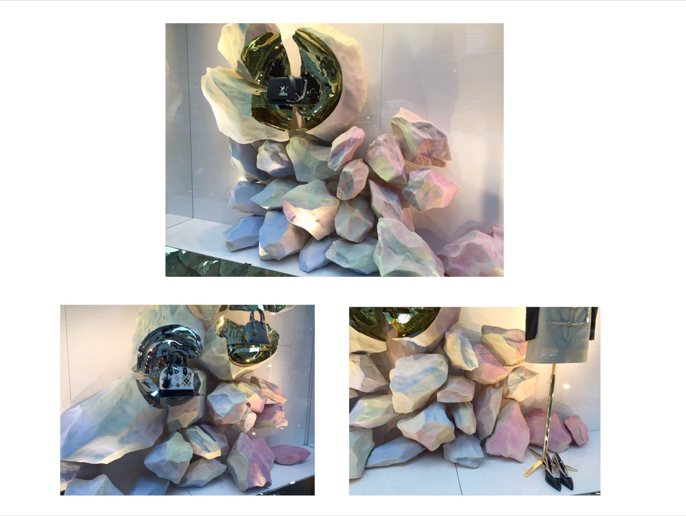
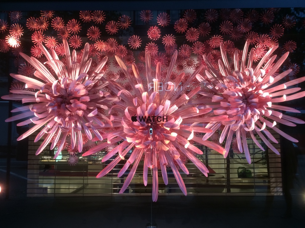
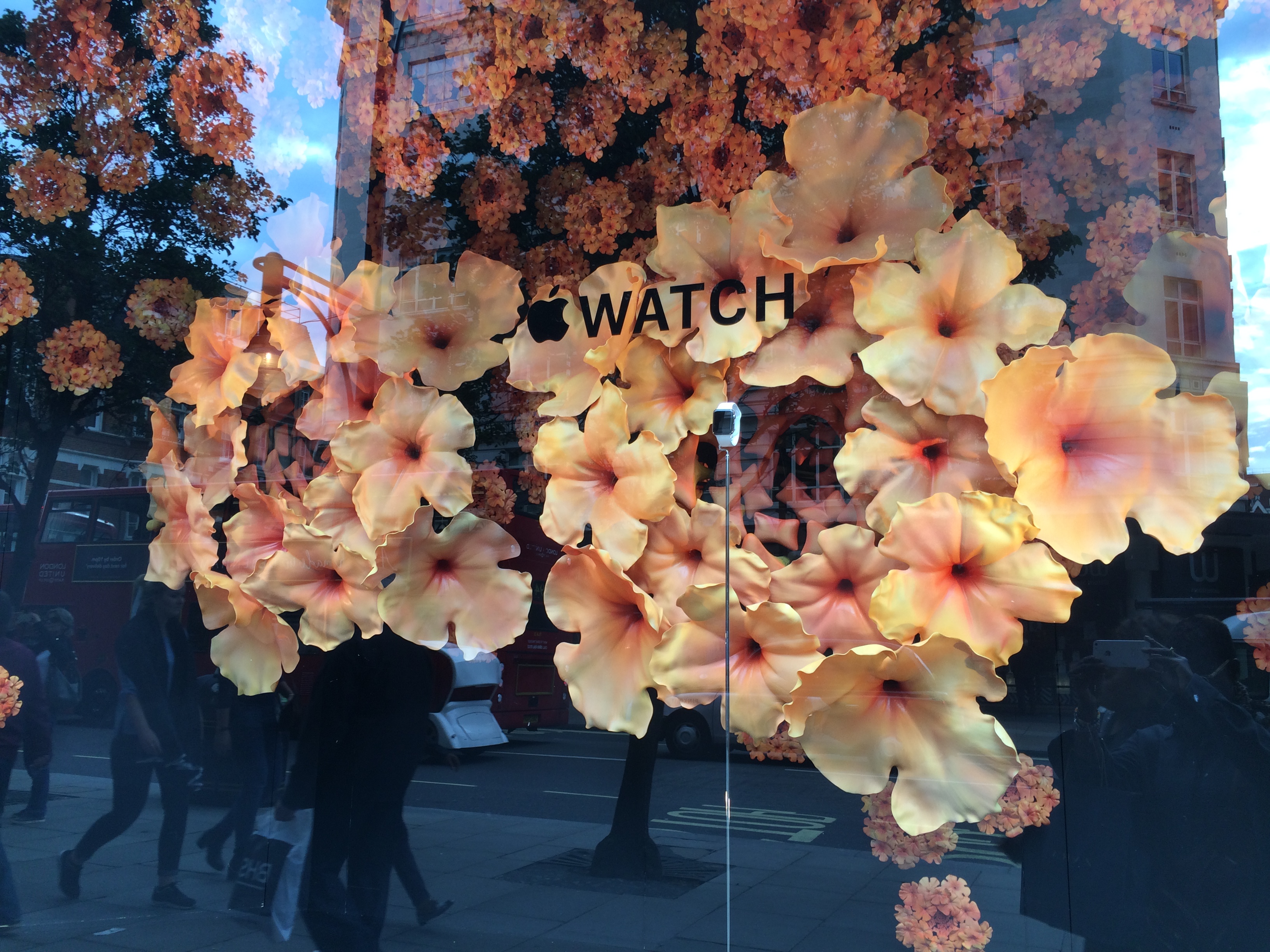
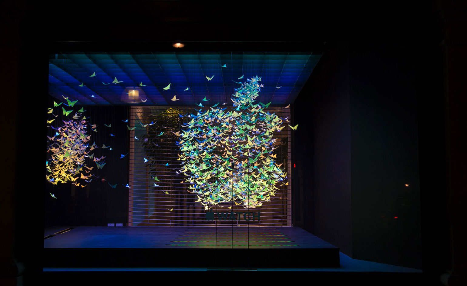
In retail windows
LV
Selfridges X Apple Watch in UK Fall 2015
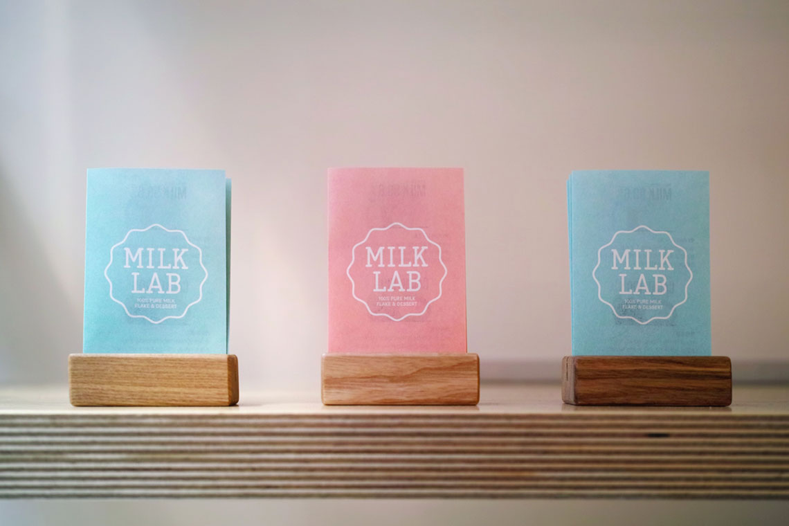
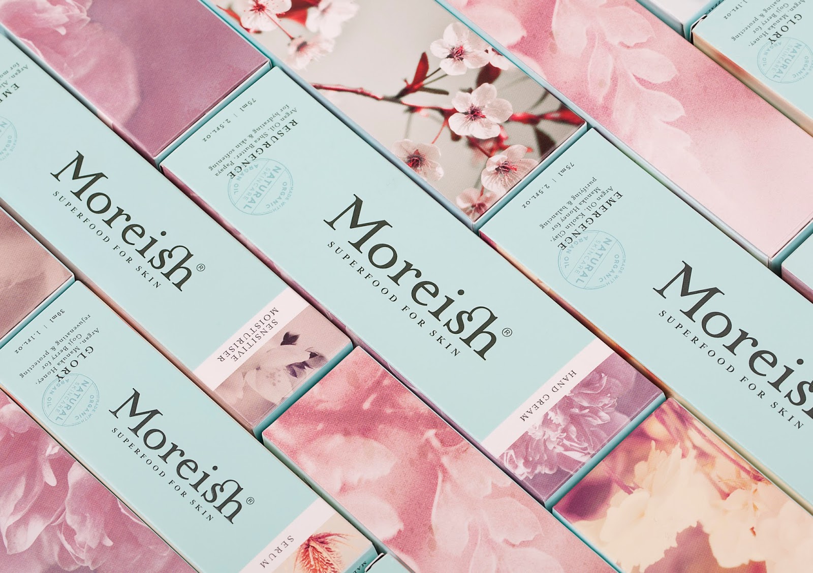
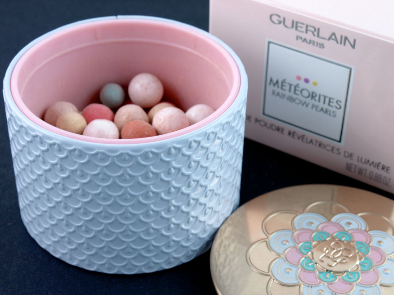
In packaging
image of milk lab courtesy of huntingforgeorge.com
Moreish skincare
Oye Cariño

Guerlain 2015 summer pearls
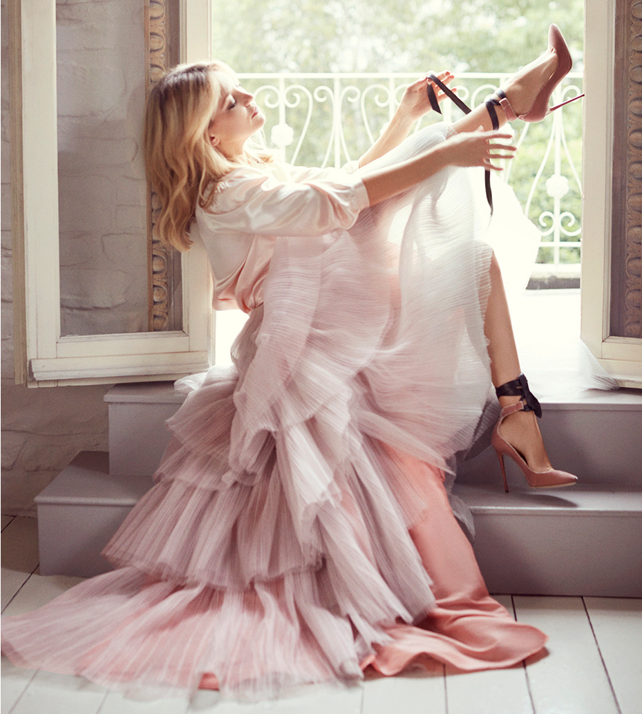
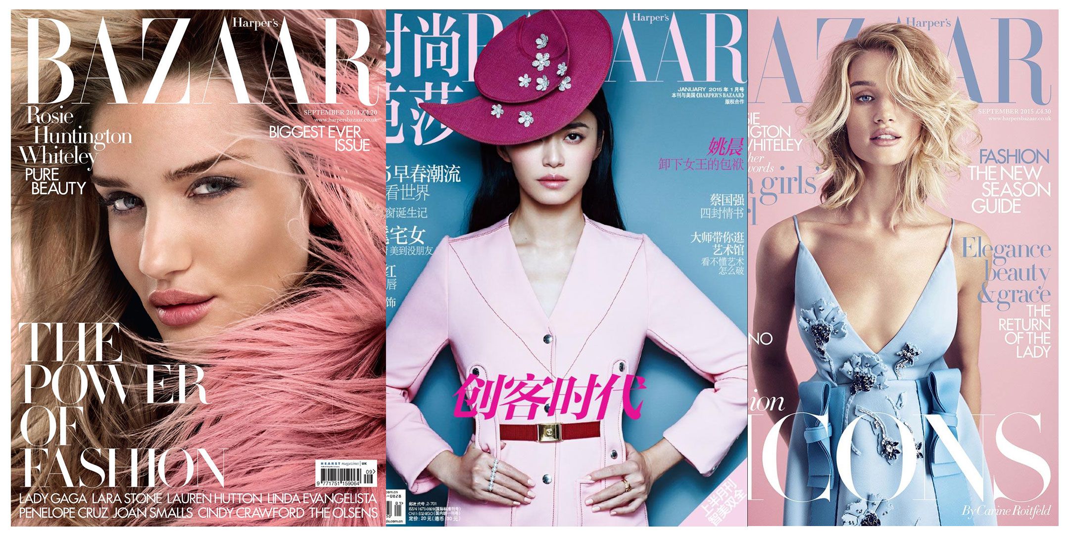
In magazine covers & print ads
Harper’s Bazaar
Valentino
In anime
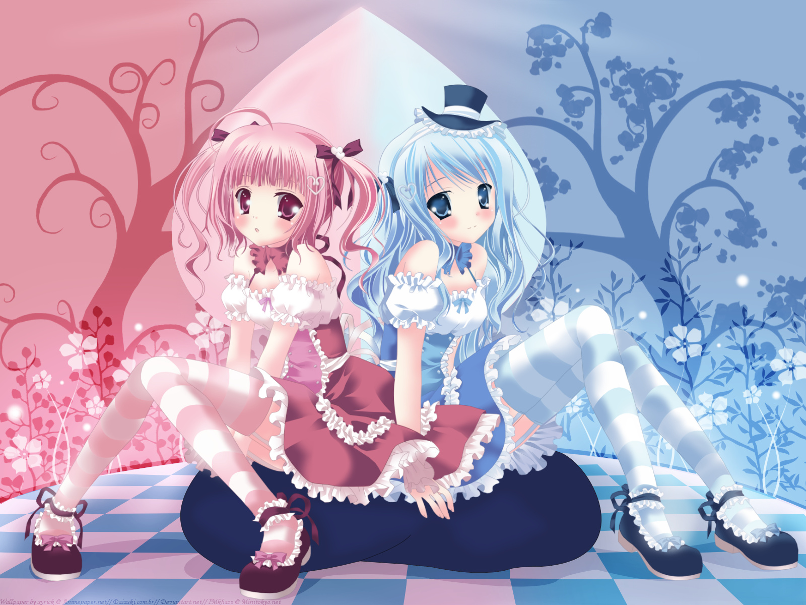
Color Combi