Eight new design trends for the new year was recently announced by iStock, with an obvious visual bias. Gone are the generic smiling faces. Here to stay are oddballs, image being king and toned-down colors.
Here are the trends and the gist of the seminar.
All credit to gettyimages and iStock.
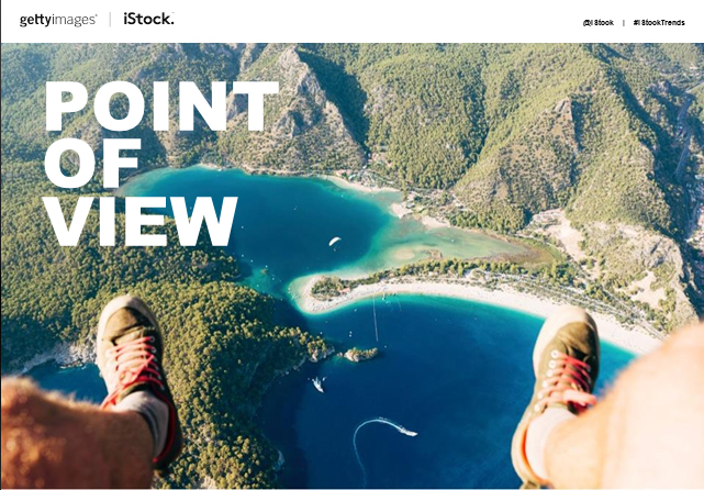
Point of View
- wearable technology: GoPro & Google glasses
- first person point of view: intimate and personal. The selfie/wefie is borne!
- business: used more this year
- dog’s point of view: unusual angles become more usual
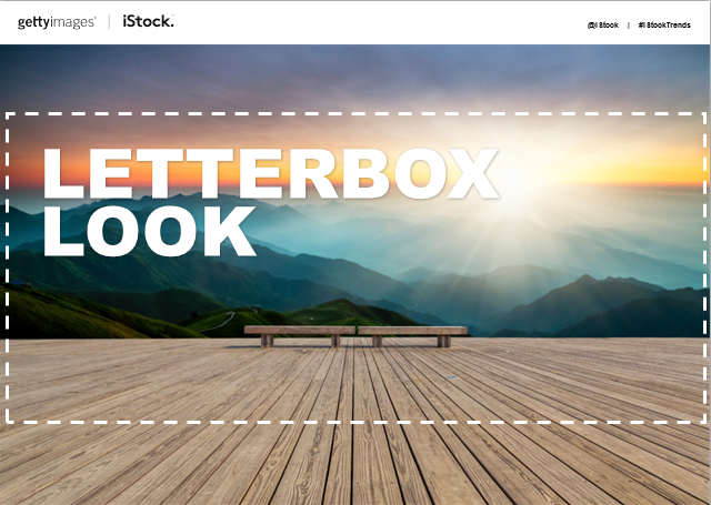
Letterbox
- design for mobile first. then laptop. more digital than print
- image ratio: 2.35:1
- e.g. Apple / bp site: eye is drawn to focus on certain things
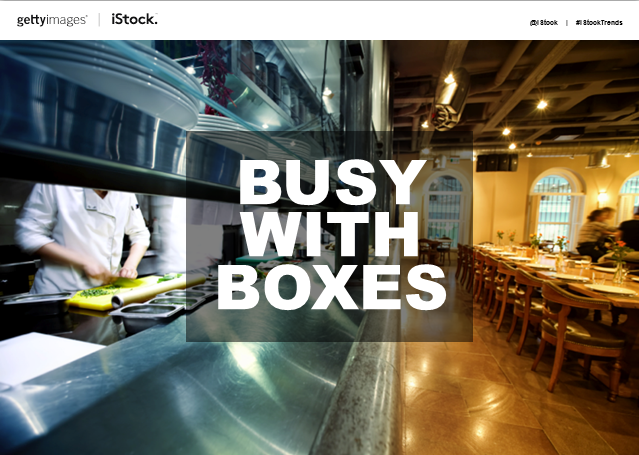
Busy with boxes
- text over image with transparent box
- …Or not. text over image. period
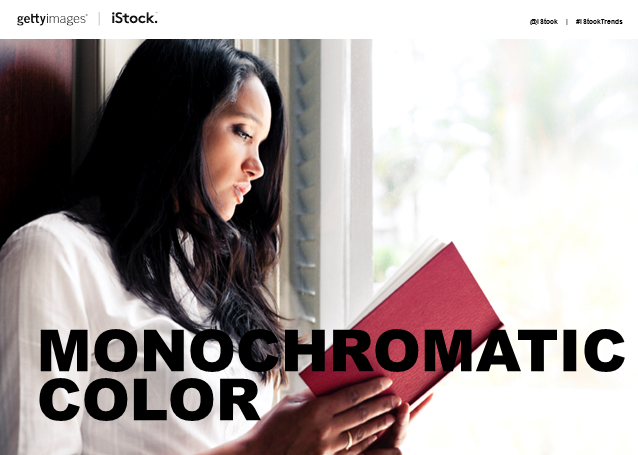
Monochromatic Colors
- low- and highlights
- flat light / cool colors to bring out other brighter colors / black
- crisp, sharp, contrast
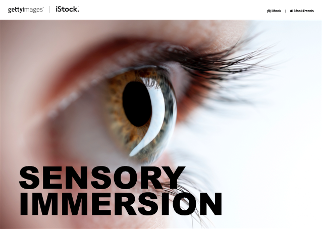
Sensory Immersion
- online exposure
- texture
- visuals working harder to engage all senses

Super Still Life
- close up | big images
- intriguing still life of mix ‘n match
- e.g. dyson: breaking down its parts
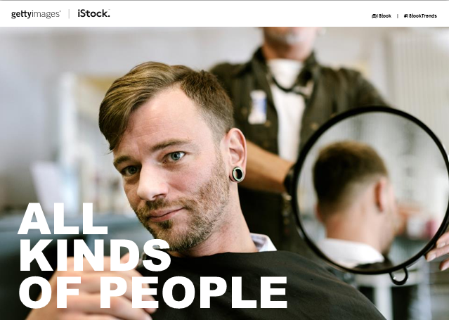
All Kinds of People
- “realness” / authenticity | diversity > ethnicity | different “family” | disability | new body shapes | old
- celebration all sorts of people, of what makes them unique
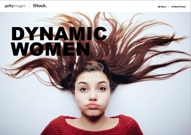
Dynamic Women
- re-picturing of women
- moving away from stereotype
- individuality / id / leadership / success / determination are celebrated